HSBC UK Kinetic
App Design
Client: HSBC UK
Role: UI / UX Designer
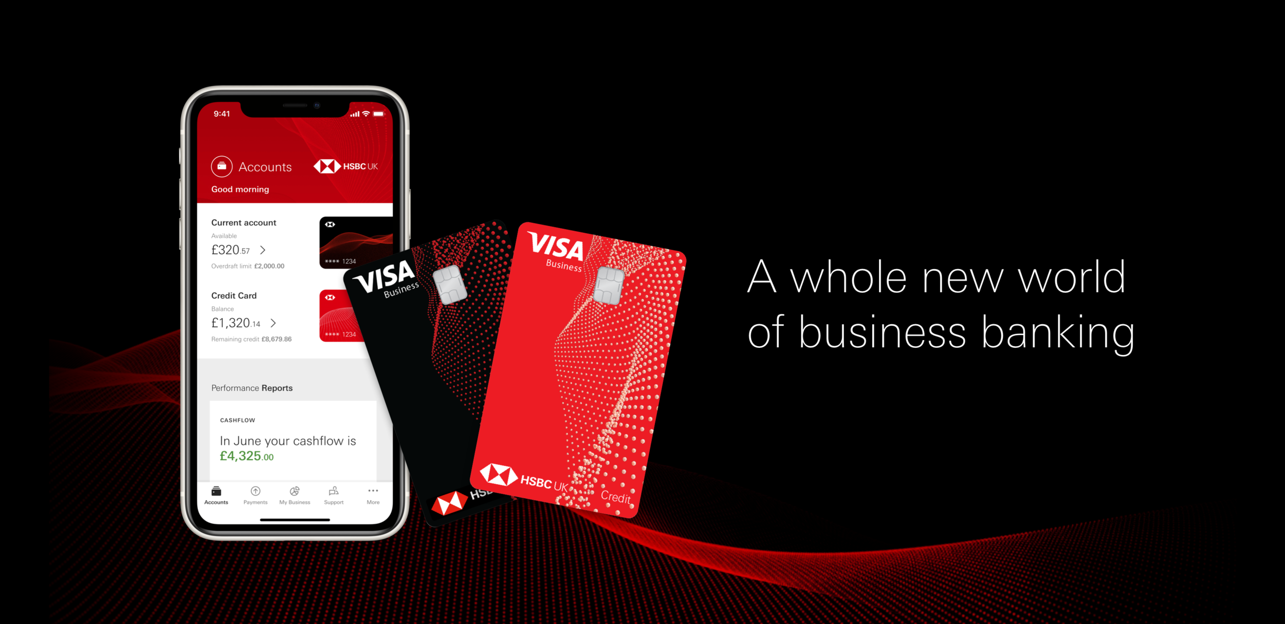
Outcome: Business banking app
About HSBC Kinetic
HSBC Kinetic is a new UK mobile banking service, designed for small businesses. It’s simple, fast and intuitive and built on feedback from over 3,000 business owners.
HSBC Kinetic launched on the iOS app store in October 2020 with ~4k users, 4.7 iOS app store rating, and a 93% Satisfaction rating. Android version is currently in early access beta.
Features
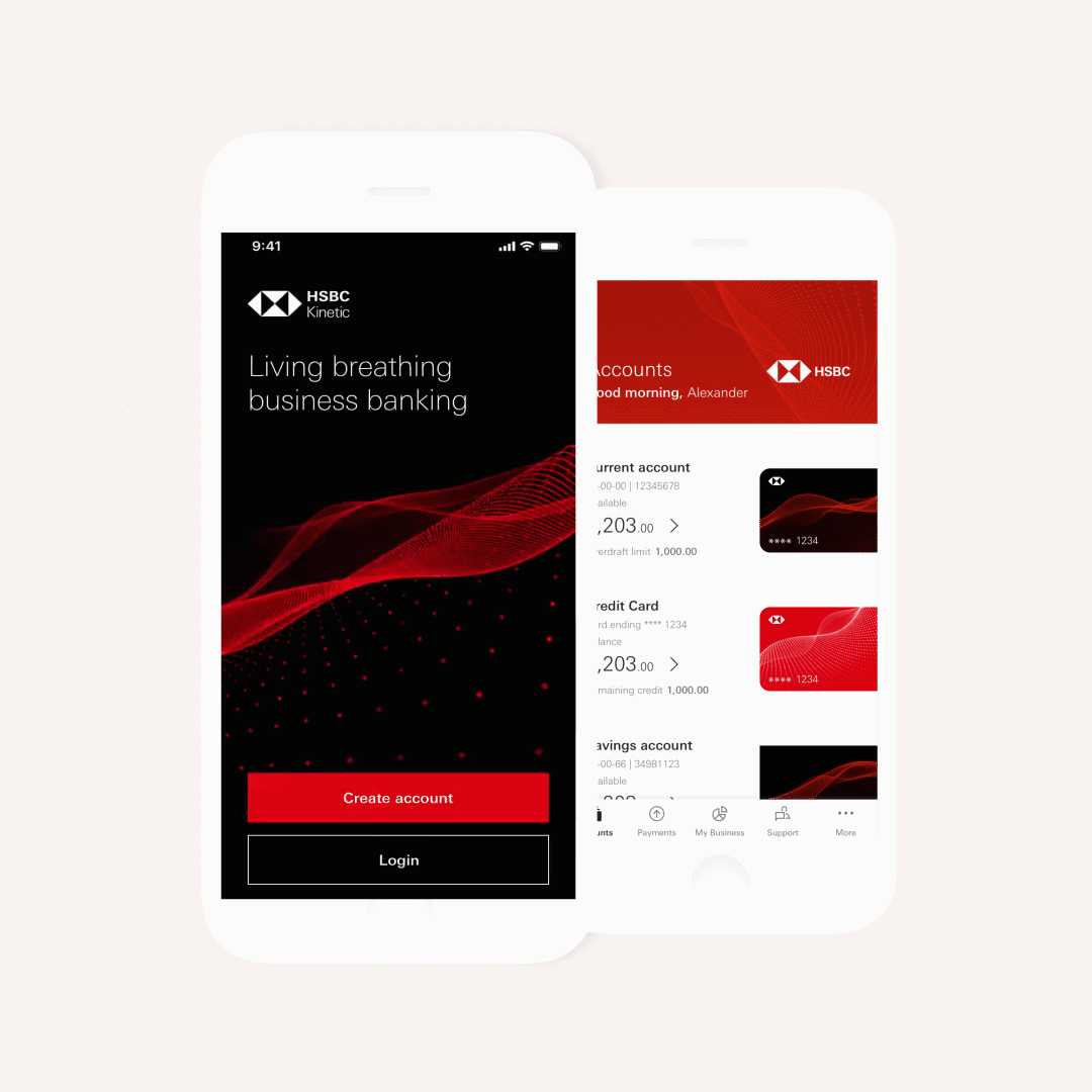
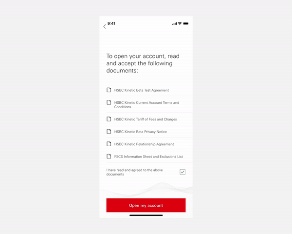
In-app onboarding Apply for an account in minutes
Cashflow insights Tools to help plan your business
Accounting software integration Keep your accounts up to date always
In-app partner benefits Find and connect with partners that benefit your business
Product proposition
An intelligent and responsive business banking service, that not only simplifies banking and clarifies what’s going on in their finances but intelligently automates key actions and even proactively suggests options for the next steps. Focused on doing business, not banking.
Design principles
The Kinetic design and experience guidelines are a useful reference created early in the project and evolved throughout the product lifecycle, this guidebook sets out many of the principles that we adhere to in our designs to keep the core values in everything we do.

Unique Characteristics
Consistent use of the HSBC Brand colours connects all the customers’ digital experiences together. The angularity of The Hexagon, the most recognisable asset of HSBC, determines the types of shapes that are selected to add meaning and emphasis to the UI.
Bold and simple
Create an expansive and open stage that focuses on the content, not the framework producing a calm and confident experience. Focus the user on the essential aspects of their next action, by using space with consideration. Further clarity is given by phasing the delivery of information and removing non-essential graphical elements.
Progressive motion
Taking the cue from the dynamic nature of the brand work. In the experience, it is not simply movement that makes things look beautiful, but motion with intent. The trick with this technique is that animations are subtle and don’t get in the way of the design, but rather aids the user on their journey.
Focussed
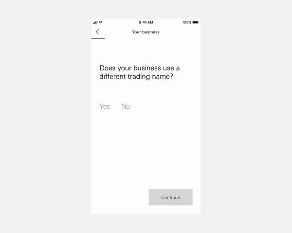
Singular focus: just one question posed per screen during flows and onboarding
By default, we show one primary CTA. Exceptions - for instance when feedback is needed - are handled case by case
Further details and/or secondary actions are easily provided on request
Screen layout allows focus on either hero items or details
Use of white space increases readability.

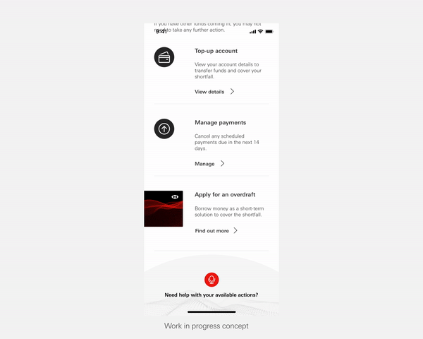
Intelligent and proactive
Use insight cards.
Link to Company House for faster onboarding. (Details added proactively.)
Use Xero and other tools to make product recommendations based on company health. Also to pre-approve loans and help a business scale.

Kinetic brand
The Kinetic waveform drives all of our brand imagery - it’s prominently featured across all touchpoints and is used to differentiate our products
Imagery and animation is produced in-house by the Kinetic design team
Animated effects are generated in-app, in real-time
Motion plays a vital role in allowing the brand to adapt and flow seamlessly with
the user experience, rather than acting as static window-dressing


Animation as part of the experience
The Kinetic waveform drives all of our brand imagery - it’s prominently
featured across all touchpoints and is used to differentiate our products
Signature moments
Maximum brand treatment to highlight key moments in the user journey
This full-screen effect is used in login, on landing screens and throughout on-boarding
Chapter screens use this effect to separate the onboarding journey into distinct sections while introducing the Kinetic brand to users
Custom transitions
We’ve developed a custom transition effect for our flow forms design pattern
This helps to make onboarding more engaging and responsive to the user than the default iOS & android screen transitions
Adds the Kinetic brand personality to the app without using distracting imagery
In addition to this, the account screen uses a custom transition to reveal the account and card options
Micro-animations
There are a number of places throughout the app where animation is used to enhance the user experience and build the Kinetic brand
Loading indicators, success graphics and other micro-animations help to add clarity to user interactions and memorable moments when using the app
The app experience
I work closely with Product Owners and Development teams across 4 different domains to deliver a consistent app experience. Working under an agile approach, we are constantly assessing and tweaking our app experience based on user feedback and the ever-growing feature list.
Hypothesis - Driven by business or research
Discover - Empathise with users
Define - What we learned
Decide - What we need to create
Prototype - Test our decisions
Evolve - Build and iterate
Features I’ve designed + delivered:
Accounts & re-design strategy
Support + re-design strategy
Cashflow & Invoices and bills uplift.
Products and services uplift
More screen
Biometrics implementation
Credit cards implementation
Authentication across the app
Digital cheque deposit
and more.
Accounts
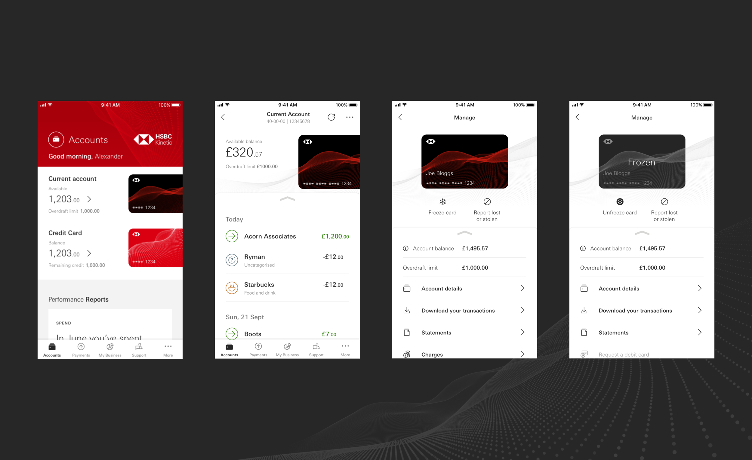
Products and Services

Spend insights and analytics
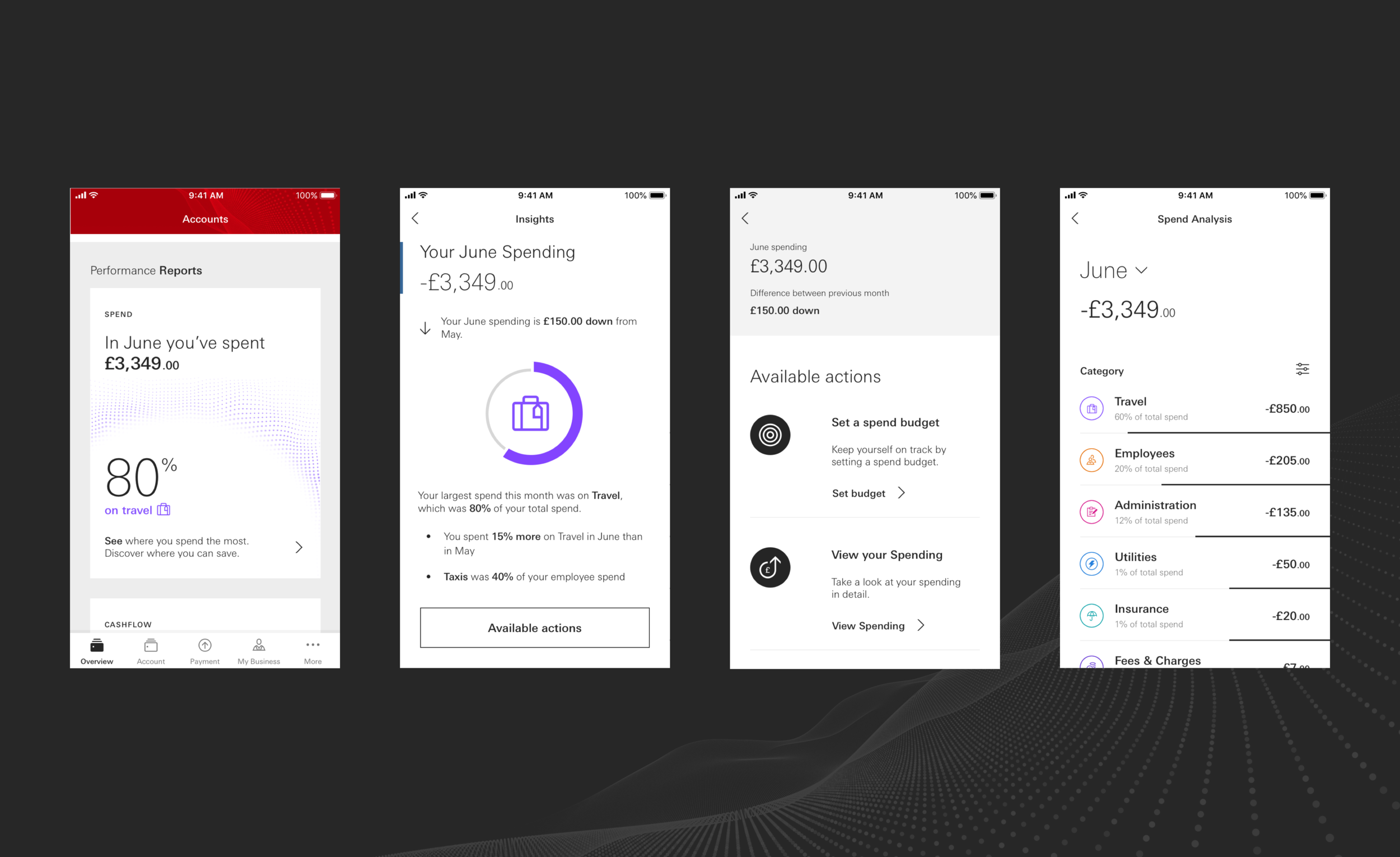
Cashflow insights and tool

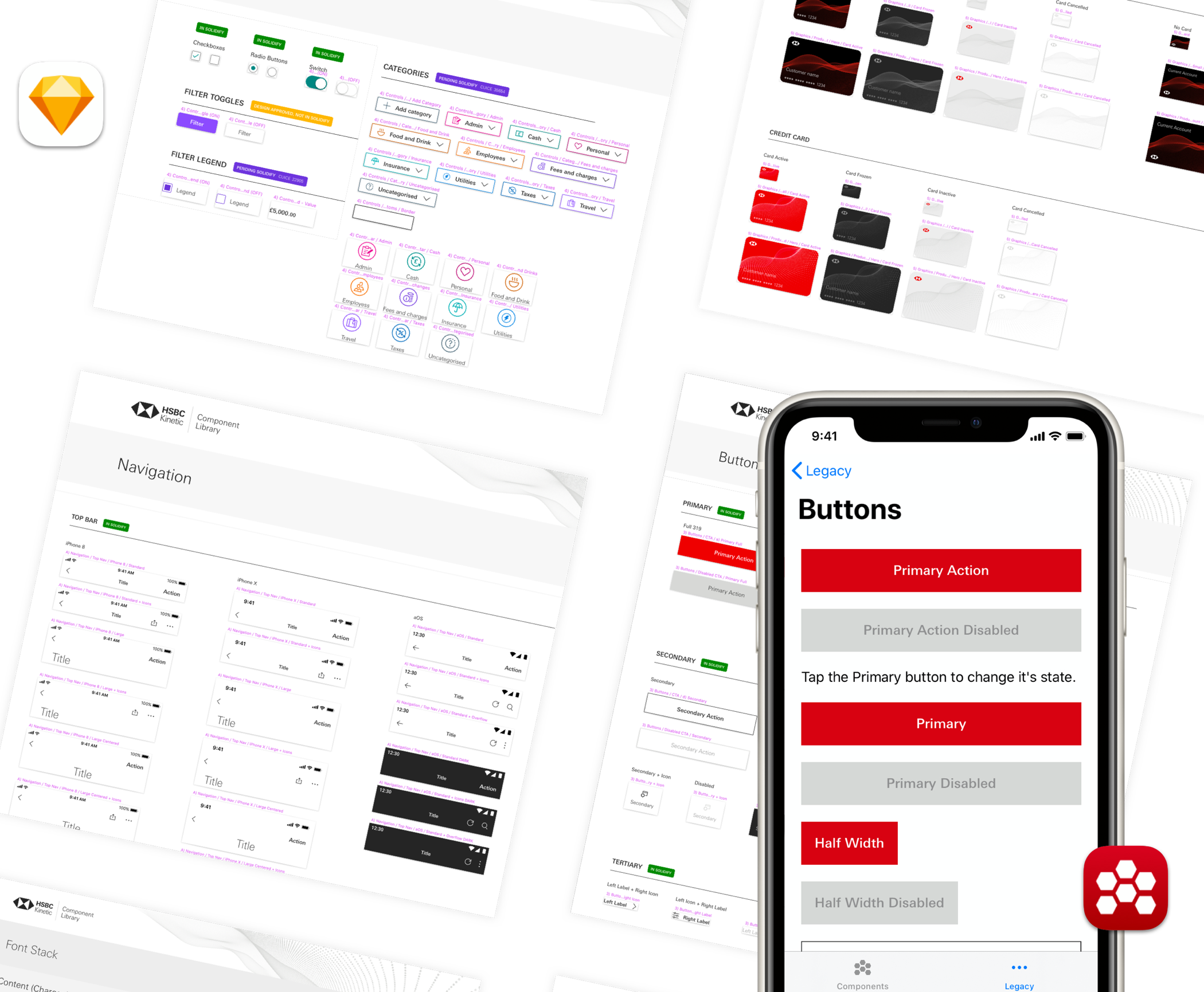
Toolkit and Solidify
Shared Design component library:
This living document syncs visual components, assets and design standards across the team
Enables designers to build screens quickly using the correct components
New components introduced to the library inform the build of new functional components in the app
Solidify Development app:
This is a valuable counterpart to the component library
Provides a snapshot of the live components that have been built
Helps to ensure our design and build assets are consistent with each other